Friday, 31 May 2013
Thursday, 30 May 2013
Does anyone have an original idea for a movie poster?
Everyday I use West Kensington tube station either going to or coming from work. As in most tube stations there are a numbers of posters up, most of them movie posters.
Just recently, this one's gone up...
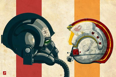
Upon seeing it I was struck with a sense that I'd seen this poster before, but for something else. And then I recalled these two from the 'not at all distant past'...
Strikingly similar. Which then got me further thinking. Is it coincidence? Is it a current trend that movie posters should look this way? Or is it that movie posters do, and have always, fallen into cliched styling?
So I did some research (by which I mean a quick Google search) and it turns out that they do.
They really do.
For instance...
 |
| The 'between the legs' style |
Or...
 |
| The 'back-to-back' style |
How about...
 |
| The 'on a bench' style |
You can see where I'm going but in the interest of labouring the point I'll continue with a few more...
 |
| The 'from behind' style |
 |
| The 'one big head in the sky looking down over numerous little people' style |
 |
| The 'black and white with coloured flames' style |
 |
| The 'one big eye' style |
 |
| The 'reflective sunglasses' style |
 |
| The 'indie yellow' style |
So it's not so much that the posters are becoming as unoriginal as the movies themselves, more that they always have been and most of us just hadn't really noticed it.
Wednesday, 29 May 2013
Numbers like these make my tiny brain hurt
Q: What will happen on the internet in the next 60 seconds?
A:
Ouch.
Legendary Journey
I hate rugby, I simply don't get all the fuss about it. I guess a lot of people feel the same about football.
But I do love good advertising, and these spots for The British Lions tour of South Africa are really rather good.
But I do love good advertising, and these spots for The British Lions tour of South Africa are really rather good.
Created by JWT London.
Street Fighter motion sculptures
This is frickin' awesome!
Art Director DanTheAdMan decided to teach himself how to use Vray and create Cinema 4D. As an inspired choice, he used the characters of Street Fighter as a reference.
Arch Nemesis
An exhibit currently on view at the Hero Complex Gallery in Los Angeles.
 |
| By Ale Giorgini |
 |
| By Dan Lazarow |
 |
| By Eric Dyer |
 |
| By Jakob Staermose |
 |
| By Mark Reihill |
 |
| By Paul Shipper |
 |
| By Rey Taira |
 |
| By Rey Taira |
 |
| By T-bone and Ajax |
 |
| By Tim Anderson |
Argentinian sex workers
86% of them are mothers, didn't you know?
So, the second execution is a little comical - pretty sure that's not the point of the campaign - but it's still a clever piece of advertising and use of media.
Friday, 24 May 2013
Thursday, 23 May 2013
Wednesday, 22 May 2013
Real-life Whacky Races
New ad for Peugeot revisits one of my favourite childhood cartoons - good times.
Friday, 17 May 2013
Thursday, 16 May 2013
I&S BBDO reinvent funeral advertising in Japan
Beautiful imagery with an equally beautiful rationale.
“In the terrifying wake of 2011 the Tōhoku
earthquake and tsunami in Japan, funerals become a commonplace ordeal as the
nation dealt with unprecedented loss. Like most cultures, Japanese funerals are
somber affairs punctuated with black and white with any deviation considered
taboo or inappropriate. Reflecting on the enormity of recent events, funeral
home Nishinihon Tenrei approached
Tokyo-based ad agency I&S BBDO
to create an ad for a trade show that would buck the trend of muted colors so
prevalent in the industry. The agency responded with this unprecedented figure
of a skeleton made with pressed flowers that overtly celebrates the cycle of
life by introducing color and elements of nature that are often avoided in such
services. The image was considered so successful it went on to win a design
merit award from the 2013 One Club
Awards.”
(Source: Colossal)
Wednesday, 15 May 2013
Thursday, 9 May 2013
Tuesday, 7 May 2013
Peugeot 208 Wacky Races
Used to love this cartoon as a kid so naturally drawn towards a real-life version.
Quite like the ad (not the car) but think the v/o is a bit dodgy and I'm not overly keen on the line either.
Subscribe to:
Comments (Atom)


